amazon design sprint
Designed a set of features within the Amazon app to support the people of Ukraine.
00
Responsibilities
User Research
UX Design
Prototyping
Usability Testing + Iterations
Solo student project for UX Design & Testing Spring 2022
A project dedicated to the crisis in Ukraine.
01
Sprint Goal
Within the Amazon app, design a set of features to support the people of Ukraine 🇺🇦
Many large businesses are reacting to events in Ukraine, finding ways to promote accurate information and support the people of Ukraine. Amazon doesn’t have a robust feature set that does this, so I decided to explore the problem and design a solution. Furthermore, the feature set needs to be designed in such a way that it can be repurposed for future humanitarian crises or major social issues.
02
Group Work: Research + Initial Sketches
03
The Outcome
04
Sketching for Efficient Flows + Visualizations
Testing + Improvements
Test Preparation
Prepared behavior interview questions and task list
What did you like or dislike?
What was the most memorable part?
Did you have any difficulty in understanding the flow of the app or think that it could be made simpler in any way?
Anything that you think I could improve upon?
Would you be willing to pay for a product like this?
Running Usability Tests
Task 1
Amazon Donation Program - Causes and Organizations, Support Ukrainian Creators
Task 2
Compare with similar items, Donate while checking out
Task 3
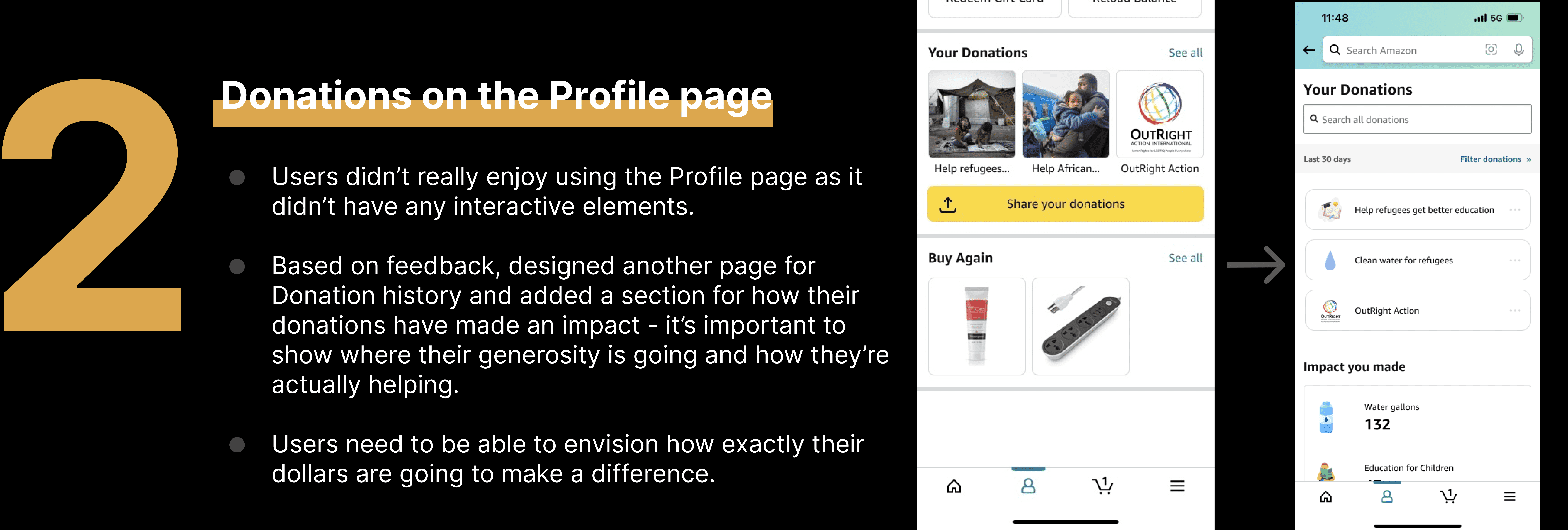
Gifting & Charity - Stand with Ukraine, Donations in the Profile page
Usability Test Results
3 major improvements in my design
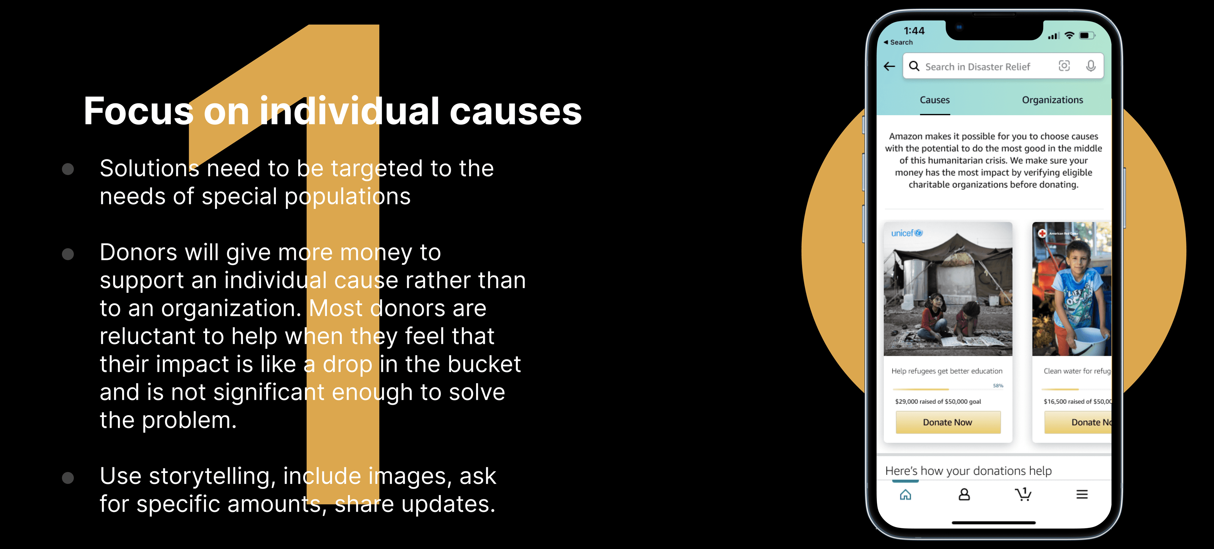
Based on various feedback from 5 other peers, I continually iterated my design - with 3 major improvements:
Other revisions:
Changed banner on top of the ‘Support Ukrainian Creators’ page - made it seem like Amazon is trying to profit off of tragedy.
Removed extra white space to reduce the user’s need to scroll.
Added the organizations logo to the Causes UI card to gain the trust of the users.
Fixed the menu bar in the Donation page to the top so that users can quickly navigate from Causes to Organizations and vice versa.
Had to click twice to select a charity in the donation widget so added the “after delay” interaction.
Fixed the issue where users were directed to unexpected page when they hit the back button.
THE FINAL SCREENS
Final Prototype with added revisions
Created with Figma
07
Reflections
Detailed sketching - For this project, my mentor instructed me to go further with hand sketching, using it to fully develop my screens before moving to digital tools. As I moved from hand sketching to prototyping, it made perfect sense and I’m glad I took his advice because it was much easier to create the high fidelity designs since I was already done with the ideation phase and I was able to match the prototype with my sketches effortlessly.
Designing for a cause - This project was my first dive into the world of philanthropic design. During my process, I wanted to be sensitive to the tragedy and reality of the Ukrainian crisis, while maintaining a persuasive and engaging interface to encourage donations.
Redesign and reflect - Starting from the existing Amazon design system provided me with a foundation to try out different approaches and assess which would provide the most natural experience to the typical Amazon user. The process of redesigning an app I use everyday enabled me to reflect on the coordinated efforts of various Amazon design teams to achieve a consistent experience.
What I would do differently
Increased integration of the made in Ukraine product marketing - In the user interviews, all participants noted that the “Made in Ukraine” cards were an understated way of promoting the cause and could be utilized in other areas of the app. This suggestion did not make the final prototype but I would consider other placements such as ‘Suggested Products’ cards on the home page if given more time.
Payment in the app redirects to browser, leading to a delayed and inconvenient experience. Designers that frequently design for nonprofits and philanthropic causes note that difficulties in the payment process can lead to users second-guessing their donations. In a future redesign, I would correct this issue to allow for seamless payment within the app and include a reward visualization celebrating the user’s donation.


