venture
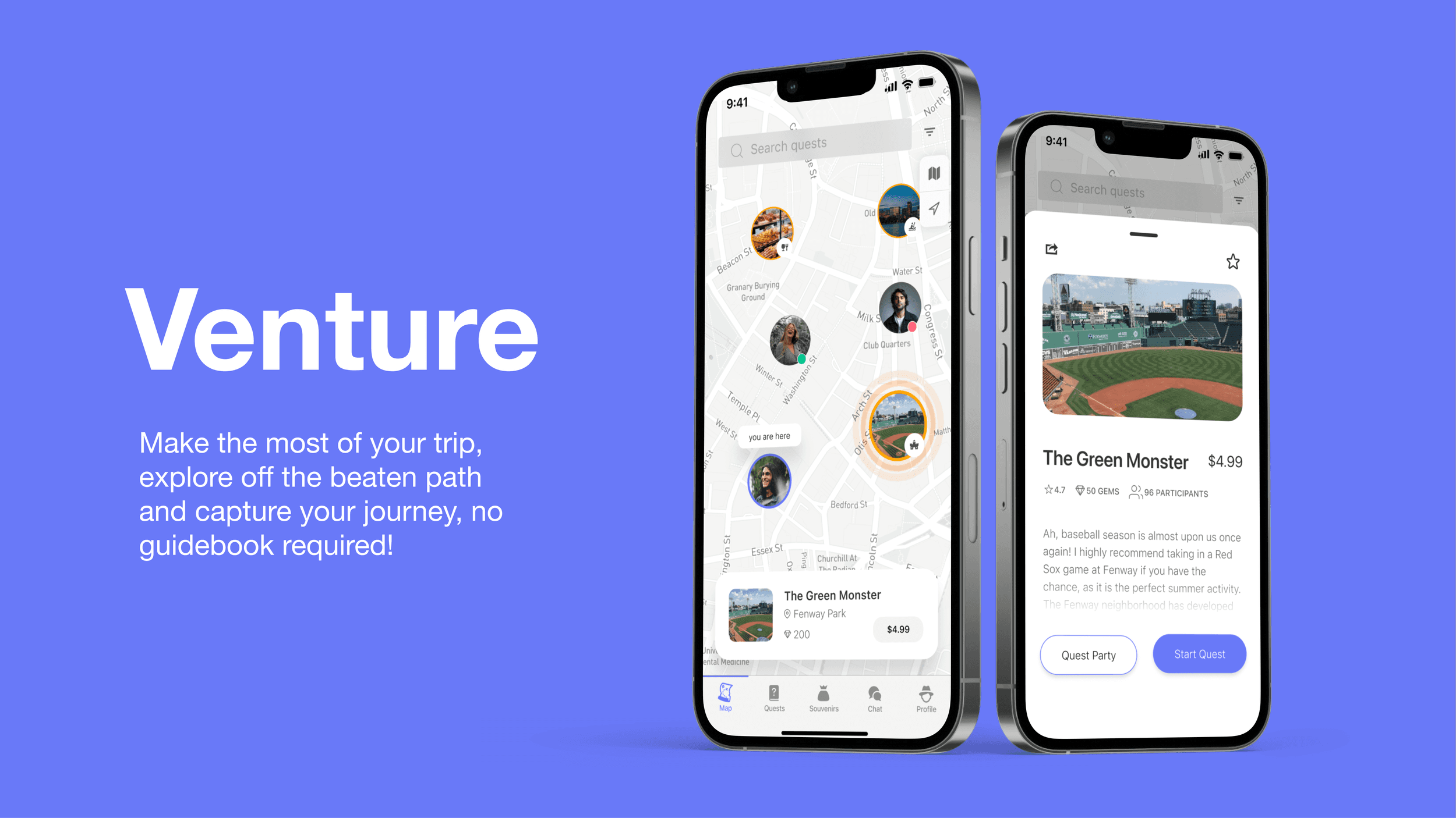
Choose from thousands of immersive quests to discover local offers and digital souvenirs along your route.
00
Responsibilities
Storyboarding
User Flows and Info Architecture
Lo-Fi Wireframes
Hi-Fi Prototypes
User Testing
Improvements
Solo student project for Adv. UX Research Summer 2022
01
Problem Statement
Tourists want to have the freedom to go wherever they want without having to follow the rigid structure of a guided tour.
Few individuals take vacations to venture beyond their comfort zones. Most people go on vacation to relax, take some photographs, visit a few sights, and meet some new people. Tourists want to see everything, but going on a guided tour usually entails following a rigid structure where you have to pay to go along with the tour guide for the whole day. Users want to have the flexibility to see what’s near them and see and do whatever they want. They don’t want to have to stick to the tour, and they want to have something to show the people that they went somewhere.
02
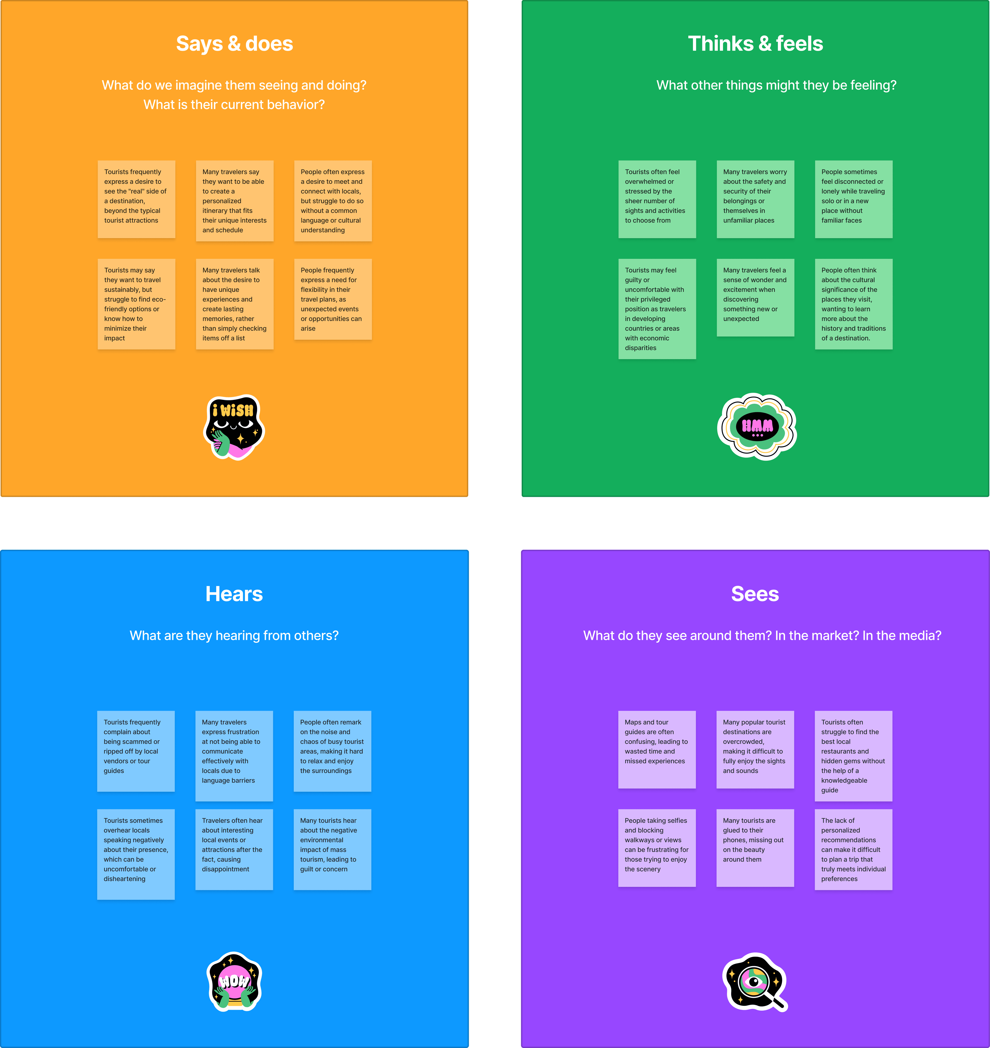
Understanding User Pain Points: Desk Research + User Interviews
・According to a survey by Expedia, a growing number of travelers are seeking unique and authentic experiences when they travel, rather than traditional tourist activities.
・The rise of social media has led to an increase in the popularity of "Instagrammable" travel destinations and experiences. A survey by Schofields found that more than 40 percent of millennials choose their travel destinations based on how Instagrammable they are.
・Research has shown that millennials are more likely to prioritize experiences over material possessions, and are willing to spend more money on travel than previous generations.
・The popularity of alternative accommodations like Airbnb has led to a growing trend of travelers seeking more authentic and personalized travel experiences. A survey by Airbnb found that 67 percent of millennials would choose a unique travel experience over a luxury hotel stay.
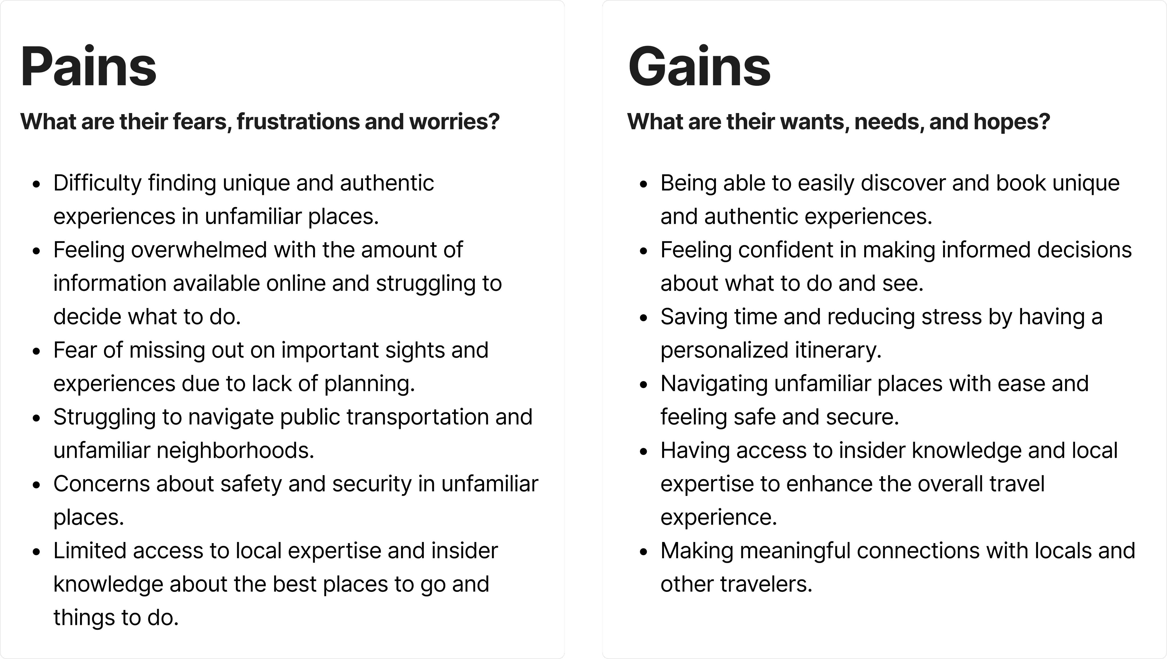
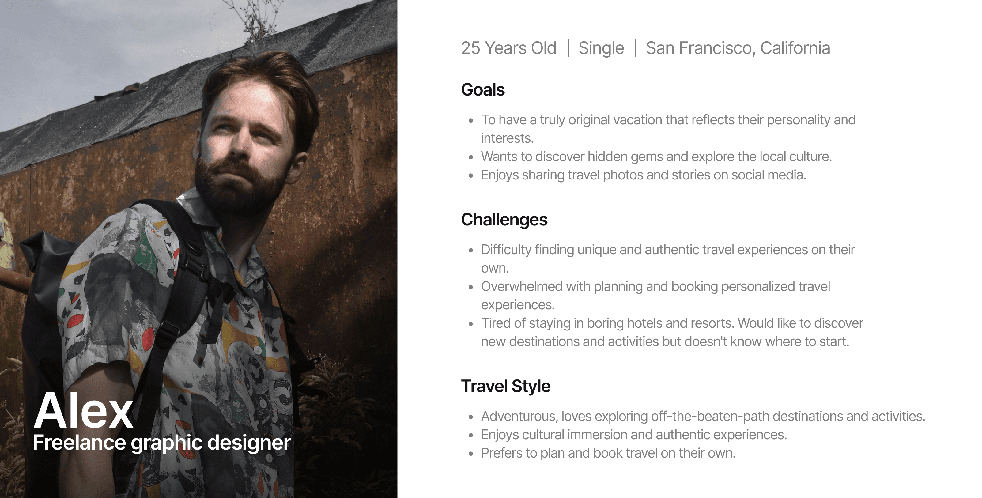
I conducted user interviews to gain insights into how people feel about personalized travel experiences and to better understand the challenges they face when planning trips. The feedback from users highlighted the desire for unique and authentic experiences that are tailored to their interests and preferences. Users also expressed frustration with the time-consuming and overwhelming nature of planning trips, especially when trying to avoid touristy activities.
These are some of the questions I asked:
How do you discover new places to visit while traveling?
Have you ever taken a travel tour? If so, what did you like/dislike about it?
What are some challenges you face while traveling that you wish could be solved with technology?
Have you ever wished for a more personalized or unique travel experience? If so, can you describe what that would look like?
How do you typically document your travels (e.g. photos, journaling, social media)?
How important is social sharing to you when it comes to travel?
03
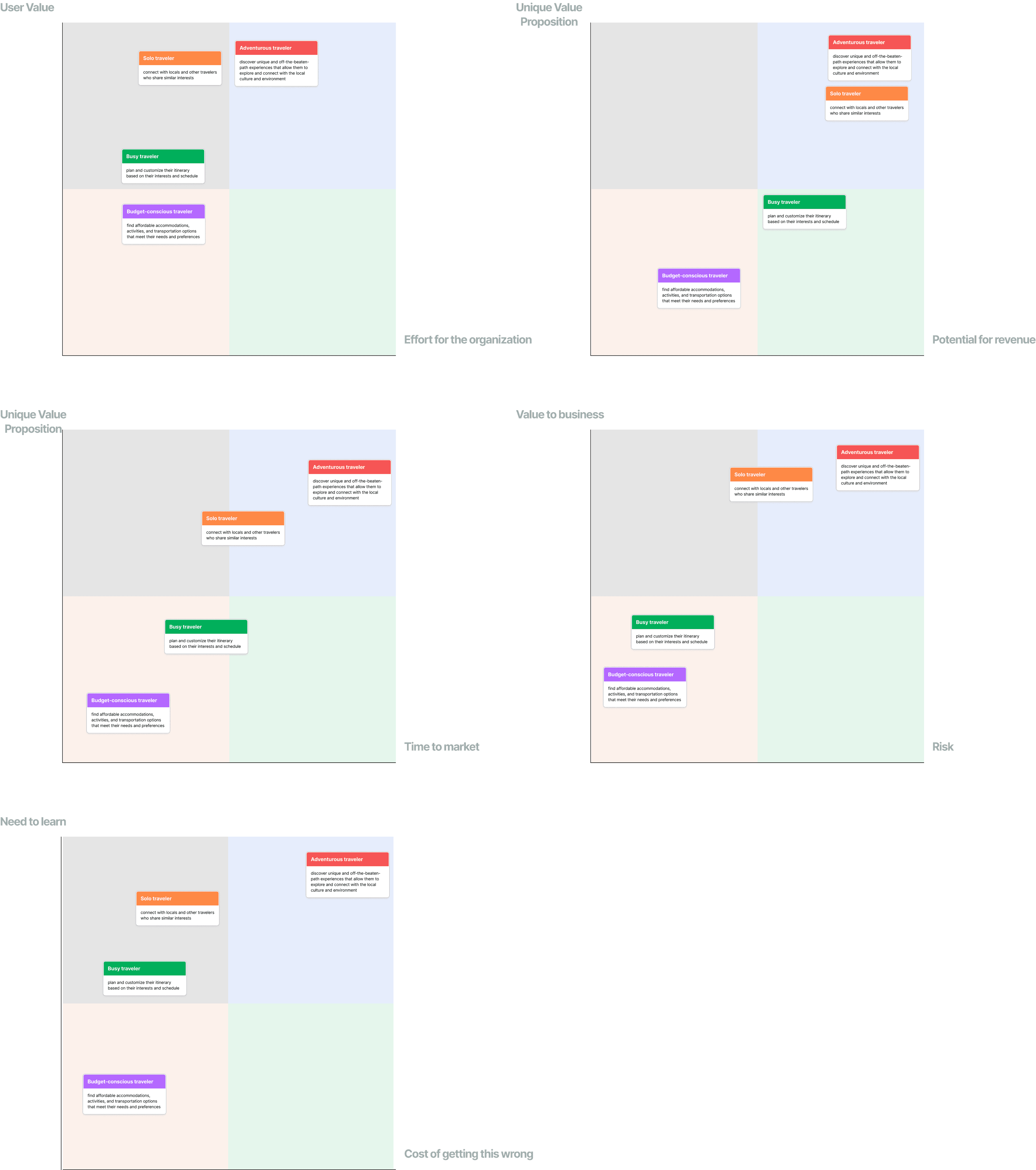
Prioritizing User Pain Points
POV Statements
04
User Journey
05
Key User Flows
Quests
AR Camera
Create an Avatar
06
Wireframes
High-Fidelity Prototype
Quests
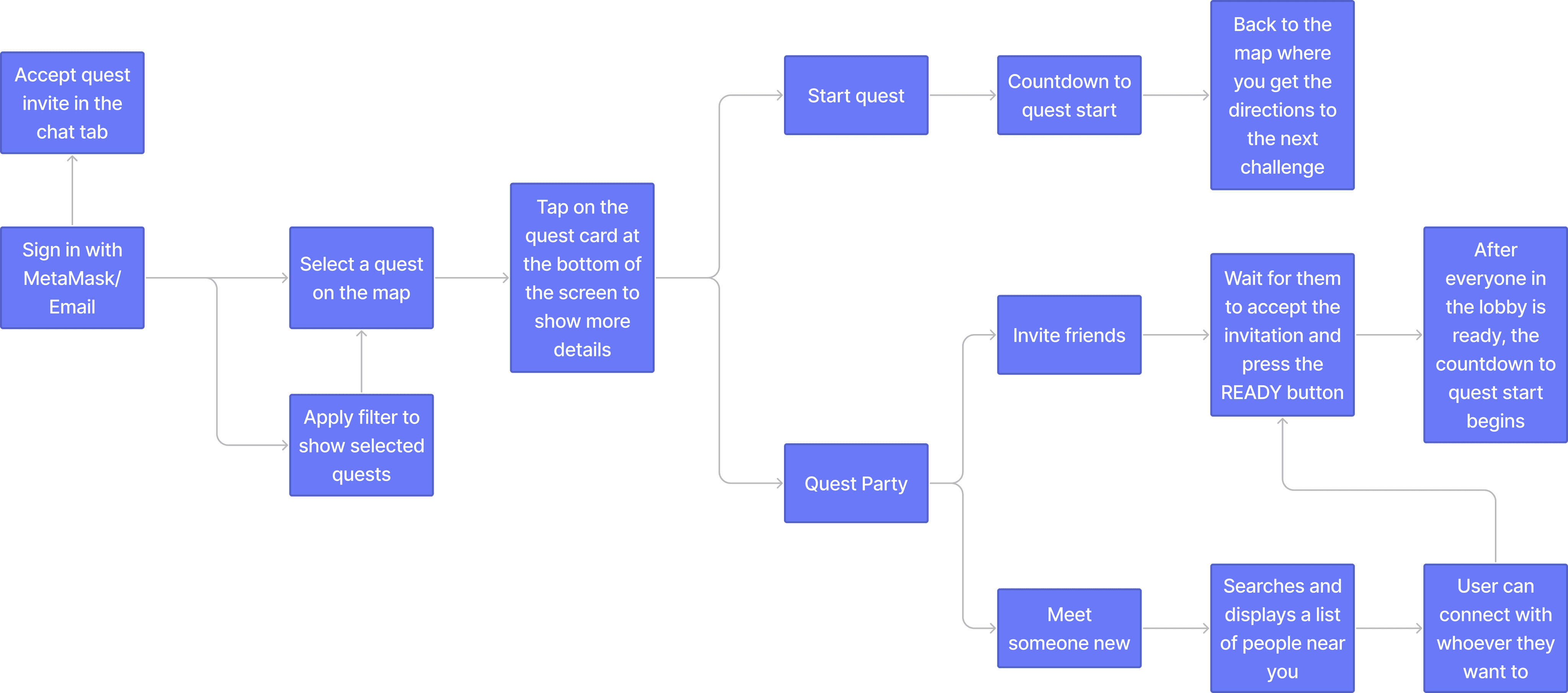
Users can sign in with their MetaMask wallet, apply filters to select the travel experience that appeals to them the most, select any quest on the map and they can choose to do it themselves or with someone.
Meet someone new on a Quest Party!
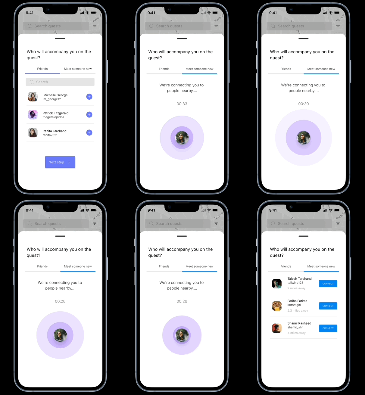
Users have the option to meet someone new if they start a quest party. They will be connected with people near them and they can invite them to their lobby.
Souvenirs as proof-of-travel NFTs
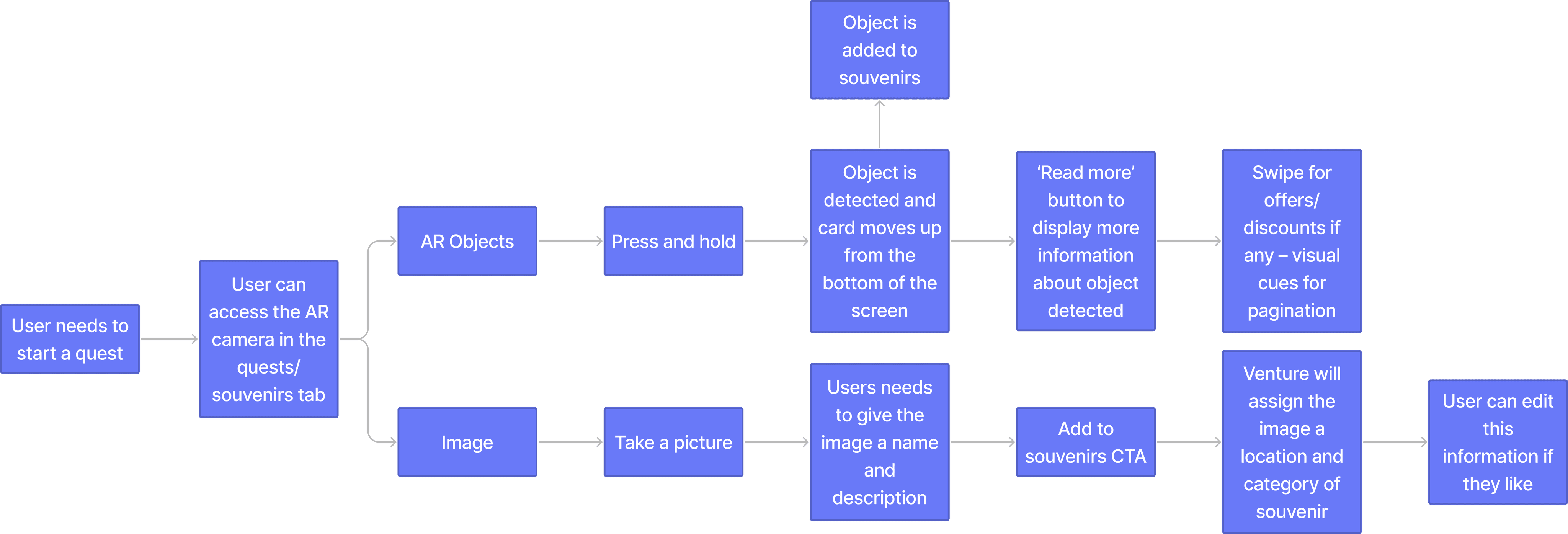
Users can access the AR camera to scan the area for 3D objects or take a picture. These objects and images act as souvenirs that can be minted as NFTs and serve as proof-of-travel. They can pin souvenirs on their profile so that other users can view them.
Create an AR avatar
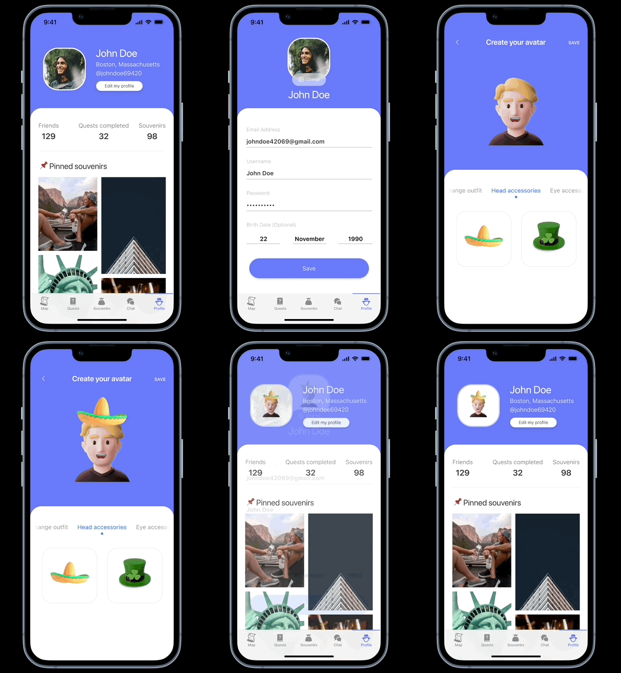
Users can create avatars for their profile and they can accessorize these avatars with souvenirs that they collected on their travels to show them off to friends.
AR camera to add images
Users can use the AR camera to take pictures and add them to their souvenirs after giving them a name and description. Venture will use the geolocation data to tag the image with the location. It will also compare the image to a database of objects, and tag it with whatever category of souvenir it falls under, similar to what Apple Photos does.
Testing + Improvements
Test Preparation
Prepared behavior interview questions and task list
What did you like or dislike?
What was the most memorable part?
Did you have any difficulty in understanding the flow of the app or think that it could be made simpler in any way?
How do you think I can improve this app?
Would you be willing to pay for a product like this?
Running Usability Tests
Task 1
Select a quest and use the AR camera to scan for objects around you.
Task 2
Go to the souvenirs tab, view a souvenir and access the AR camera to add an image as a souvenir.
Task 3
Go to the profile tab, then edit profile and create an avatar for your profile.
Usability Test Results
OVERVIEW:
The instructions for the first round of testing should have been clearer so I revised the user testing script after testing with 1 user.
I thought it was interesting to watch the users move through the prototype and complete the tasks on their own without me sitting in front of them or being on the call, so it wasn’t possible for me to interject at all. I could clearly tell where they experienced problems and where they were able to breeze through just by watching the recording.
Overall, the users felt that the UI was very clean and it perfectly fits into the Web3 and AR visual identity.
They thought that the idea was innovative and 2/3 users would be willing to pay for a product like it.
WHAT WORKED:
Users liked the social aspect of the application, and how the souvenirs tie in with it. The concept of styling your avatar with souvenirs from places you’ve visited really appealed to the user and they felt it really added to the travel experience.
Users thought the AR camera was really fun and engaging and it reminded them of Pokemon GO, which was the inspiration for my app.
Users loved the map view, the clean look of the UI and how the selected quest on the map was flashing.
WHAT DIDN’T WORK:
When the user tried to invite friends to the quest party, the invite button is a ghost button initially and it gets filled AFTER selecting it – this confused the user.
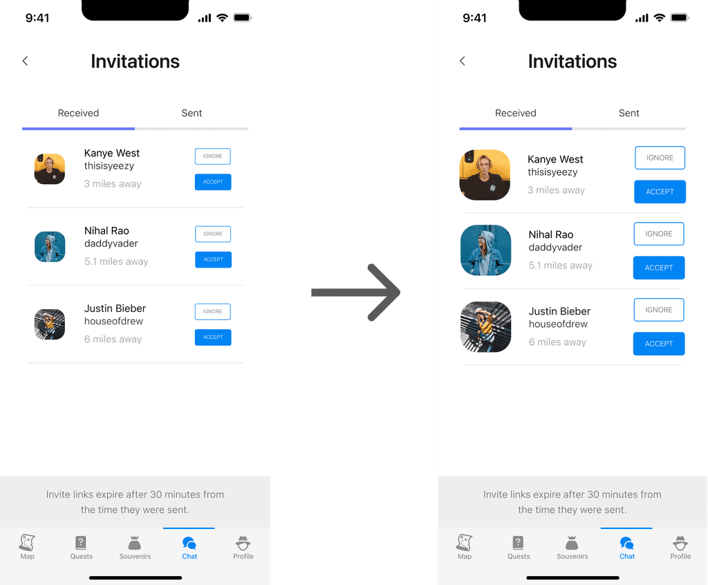
Some of the buttons felt small and users felt that they could be misclicking them as a result.
The icons in the souvenirs tab could be improved as the user felt they all looked very different stylistically.
The user also reported how there are 2 different kinds of souvenirs (AR objects and images) but both of the badges looked identical.
RECOMMENDATIONS:
Making the buttons larger would be helpful.
It would be cool if you could import an NFT as your avatar and have that coming straight from the blockchain.
Update the icons and badges in the souvenir tab.
Have chat and invitations on the together as two separate items you can click in and out of.
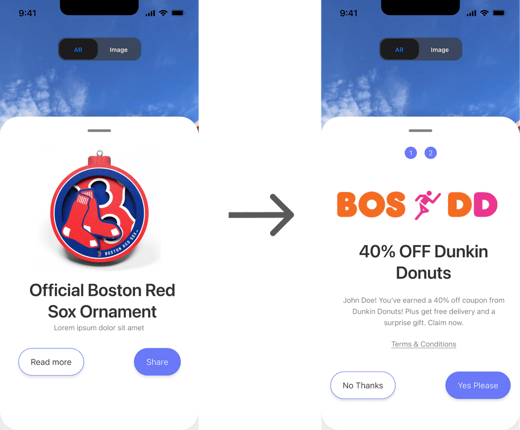
Tie in discounts/bundles/offers with local businesses to entice people to use the platform.
Have an option to do just 1-2 things instead of a full quest to explore the city just in case the user has a full itinerary.
Here is a link to a highlight reel where I’ve curated some of the most important insights and feedback.
https://app.usertesting.com/h/12bzFf9PBb9MBLkXyy_o?shared_via=link
Improvements
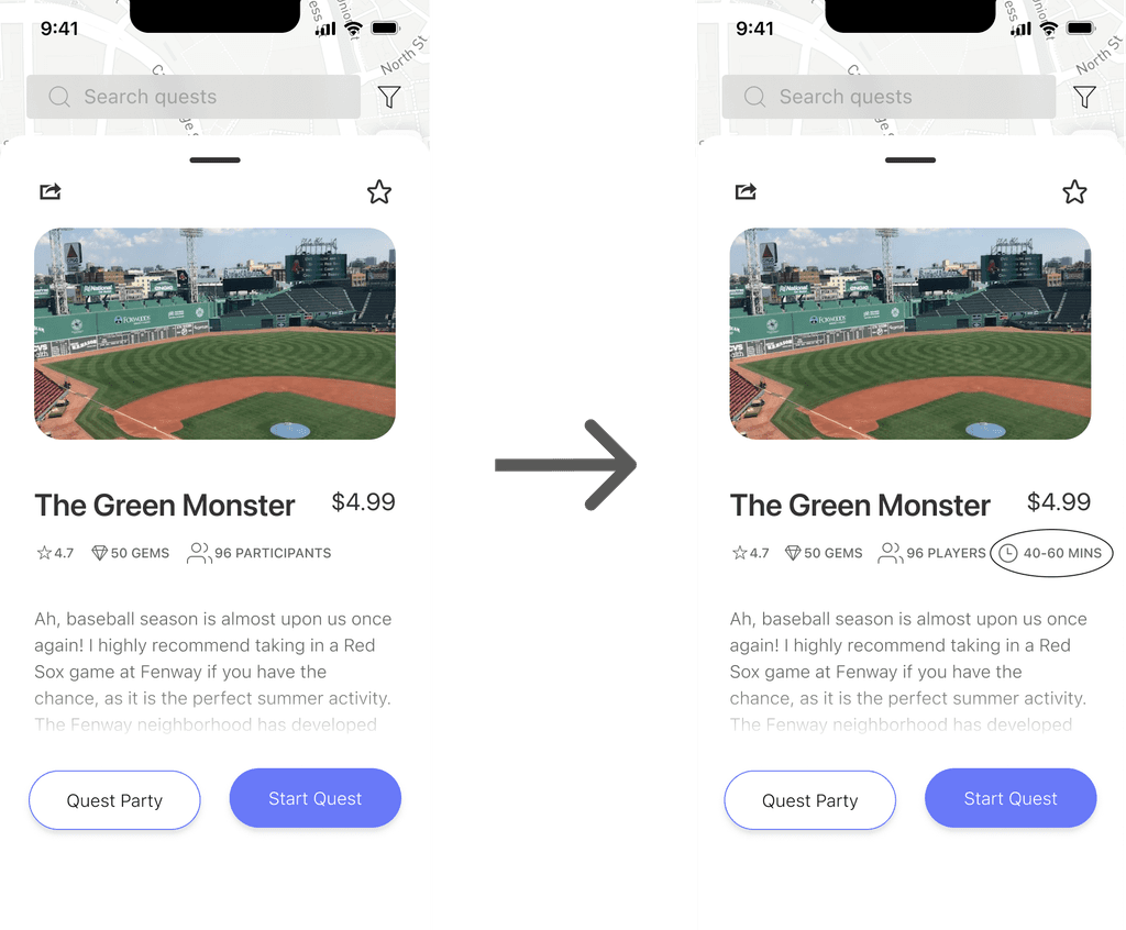
Telling the time upfront
Users said that they would want to have the option to do just 1-2 things instead of a full quest, so I decided to add in the time it’ll take to complete the quest so that they can decide for themselves.
Made the buttons larger
Tie in discounts
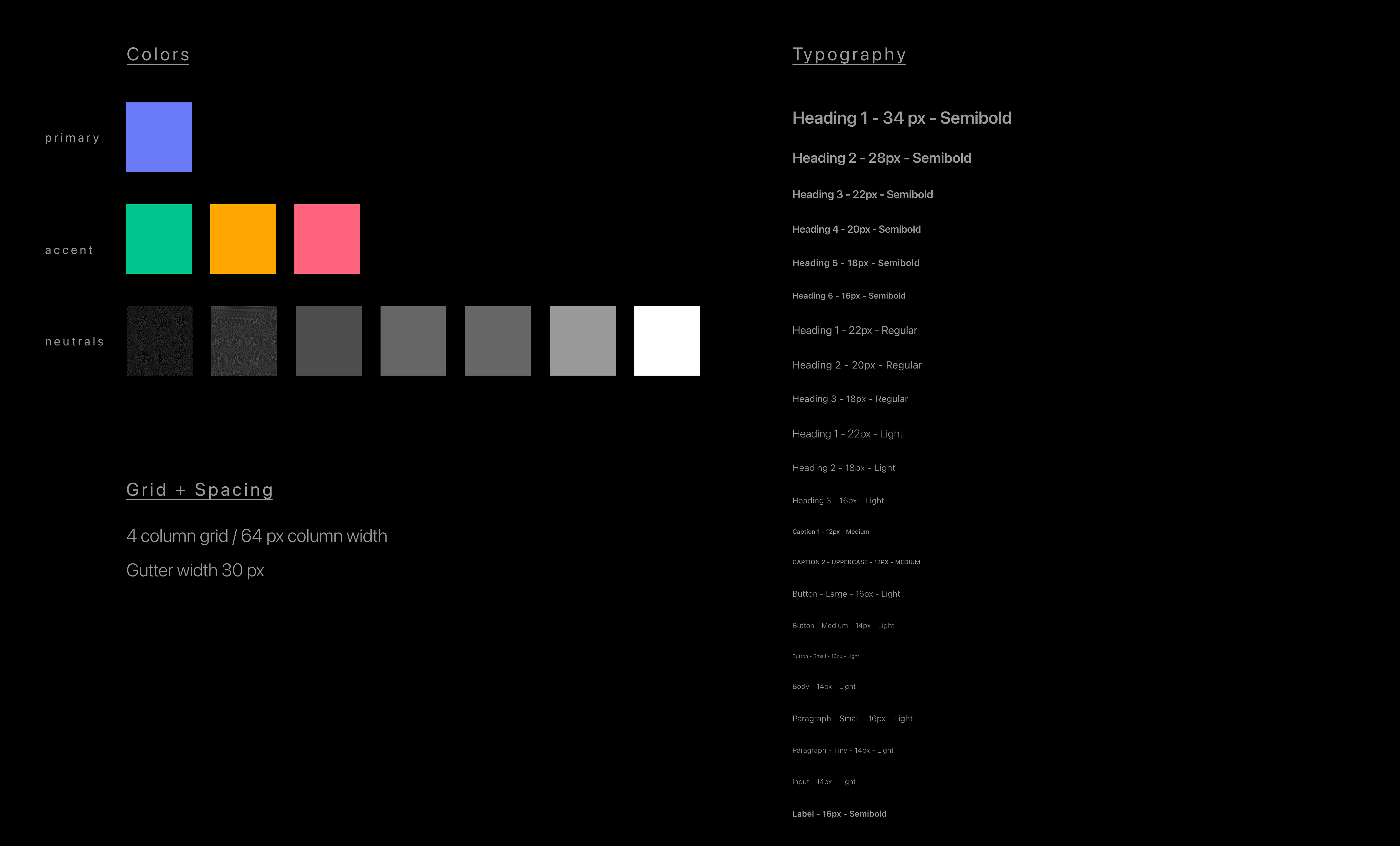
Style Guide
Reflections + What I would do differently
Designing with speed and why it’s important- This was the first project where I didn’t use every tool in my UX skill set due to time constraints. My mentor gave me an insight into how UX designers have to work in the real world, where you have to meet very tight deadlines without sacrificing quality and you just have to deliver, so I really learned to optimize my time.
The project is never going to be perfect. There are so many things I’ve thought of designing, not necessarily new features, but things that tie in with the features I already added to make the user experience ideal. I feel like the idea is a tricky one to implement and I’m proud of myself for getting this far. I hope to come back to this project in the future to implement all the other cool things I’ve thought of!
Branding and game design- At the end of the project, I came back to branding and the logo design, but I really couldn’t come up with anything I liked. I didn’t think it was that important at the moment, but that’s definitely something I would like to improve. Apart from that, I would like to give more thought to the structure of the quests, and how the user proceeds from one challenge to the next.
Token system- I want to create a utility token for Venture and users would need to purchase these tokens to unlock quests. Influencers are given a cut from the amount and the tokens will give them privileges like discounts with partnered restaurants, hotels, activities, etc. Spending tokens would feel much easier than spending the same amount in fiat currency. It reduces friction at the point of sale.
