wayfair
Streamlining internal tools and redesigning the mWeb cart experience
00

In Spring 2023, I had the opportunity to join Wayfair as a Product Design Co-op, where I tackled high-impact design challenges across enterprise tools and customer experiences. From enhancing operational efficiency for warehouse teams to refining the checkout journey for millions of shoppers, I demonstrated my ability to solve complex problems, balance user needs with business goals, and deliver thoughtful, results-driven design solutions.
enterprise solutions
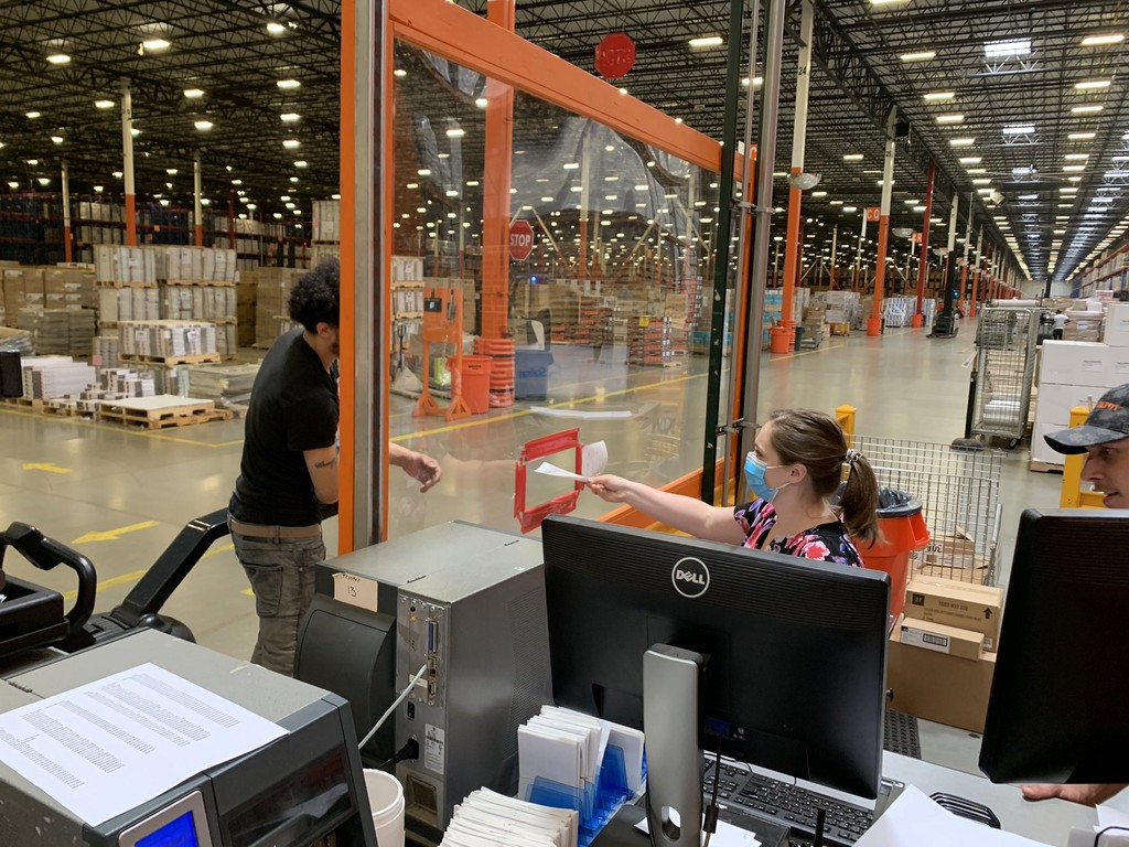
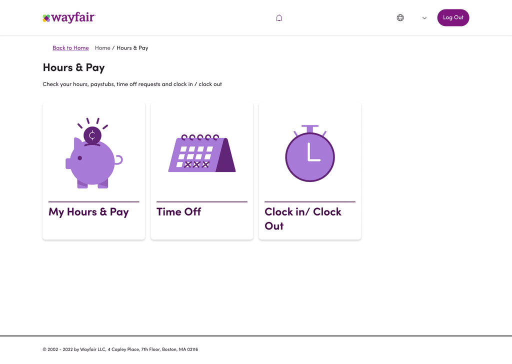
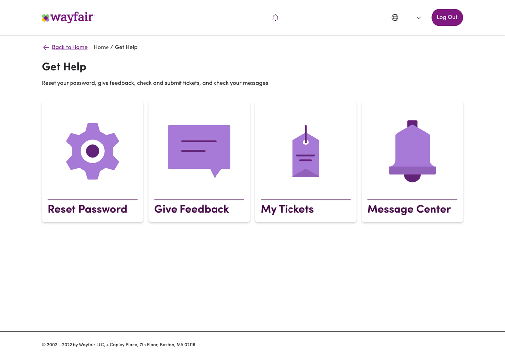
Collaborated with cross-functional teams to design a mobile portal for Wayfair’s warehouse staff, simplifying tasks like benefits access, time-off requests, and hours tracking.
lower funnel customer experience
I led the redesign of Wayfair’s mobile web cart to make checkout smoother and more engaging.
Key Screens
Home
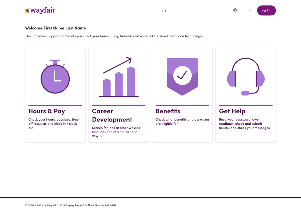
Hours & Pay
Career Development

Get Help
Benefits

Grounding the Design in Real Employee Needs
After the Kentucky visit, we synthesized our findings and established key design principles to guide the kiosk solution:
Intuitive and Minimalist Navigation: Based on employee feedback, we prioritized simplicity. Our goal was for users to find answers within three taps or fewer, emphasizing “self-service without hassle.”
Clear, Actionable Buttons: We leveraged Wayfair’s Homebase design system but adjusted for larger button sizes and more visually recognizable icons to suit non-technical users.
Language Accessibility: To support a diverse workforce, we added language selection options and used plain, accessible language to avoid jargon.
We initially considered using handheld scanners for the Employee Support Portal, leveraging existing equipment to reduce costs. However, workers found the small screens hard to navigate and experienced connectivity issues, especially in some warehouse areas.
Opting for kiosks provided a stable, dedicated access point that improved usability and allowed employees to focus on personal tasks without interruptions. This investment respected their time, boosted morale, and created a reliable solution tailored to their needs.


problem statement
Shoppers faced a fragmented checkout experience due to inconsistent design and unclear actions, hindering usability and overall satisfaction.
The goal was to identify best practices and key areas for improvement, ensuring an enhanced and competitive cart experience for our customers.
discovery

I looked at 10 leading e-commerce players (direct and indirect), some of which include Amazon, Target, Home Depot, Ikea, Walmart, Nike, Apple, Zara, and Gymshark.
key takeaways


Variation A (Current)


Words used to describe current Cart page
Variation B (Redesign)


Words used to describe redesigned Cart page
What Users Said
"Lorem ipsum"
Participant 1
"Lorem ipsum"
Participant 2
"Lorem ipsum"
Participant 3
"Lorem ipsum"
Participant 4
05
Takeaways


Wayfair was an incredible learning experience in designing with real-world constraints. The ESP project taught me to adapt to business needs and create something functional yet intuitive for warehouse employees, balancing usability with operational goals. Working closely with PMs and engineers, I learned how collaborative problem-solving can push a project forward, even with limited resources.
Redesigning the mWeb cart showed me the impact of data-driven decisions on customer retention. Using A/B testing and user feedback, I crafted a more seamless checkout experience that directly boosted conversions. Through both projects, I gained practical insights into navigating design systems, understanding user needs, and making a measurable impact—skills that will stick with me as I grow!
03